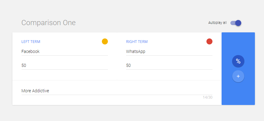
Well, Google on its blog post said that this free tool is aimed at journalists, but it looks like anyone can use it however they want. Let me tell you this is just a simple tool which lets you create GIFs to compare statistics about two different topics.
Users can compare Android and iPhone. Or they can even compare Windows vs Linus. This tool creates bar charts that we mostly see during elections. Google wrote in a blog post: “Data visualizations are an essential storytelling tool in journalism, and though they are often intricate, they don’t have to be complex. In fact, with the growth of mobile devices as a primary method of consuming news, data visualizations can be simple images formatted for the device they appear on.” Users just need to visit this link and then have to enter two data points, text, choose the colors, choose the explanatory text and then hit the Launch comparisons or Download as Gif button. You can use the free tool from here. So, what do you think about this? Share your views in the comment box below.
